Introduction
Getting someone to click your native ad is the easy part. What happens next is where most advertisers throw away the advantage.
Native ads earn clicks because they blend into editorial environments — they feel like content, not ads. The moment a reader hits a page that screams "sales funnel," that trust is gone.
That mismatch between editorial context and hard-sell landing page is one of the most overlooked conversion killers in digital advertising.
Landing page specificity matters more than most advertisers realize. Research from HubSpot found that companies with 10–15 dedicated landing pages see 55% more leads than those using fewer — a strong argument for building pages that match the exact context your traffic came from.
This article covers why native traffic needs its own dedicated landing page, which elements actually drive conversions, how to match your page to your audience's mindset, and how to keep improving performance over time.
Key Takeaways
- Native ad readers arrive in a content-reading mindset — meet them there or lose them in the first scroll
- Message match between your ad and landing page is non-negotiable; a jarring transition kills conversions
- One primary CTA per page; match the CTA type to where the reader is in their buying journey
- Pre-landers work for cold audiences; direct pages work better for warm traffic and simple offers
- Your first landing page is a hypothesis. Continuous testing is what turns it into a conversion engine.
Why Native Ad Traffic Needs Its Own Landing Page
The Mindset Problem
Search traffic arrives with explicit intent. Social traffic is in scroll mode. Native ad traffic is different from both: these readers are in an active, content-reading mindset. They clicked because the ad looked like editorial content, and they expect more of the same on the other side.
Drop them onto a generic homepage or a product page built for paid search traffic, and you've broken an implicit contract. High bounce rates follow.
A homepage is a multi-destination hub designed to serve every possible visitor. A native landing page is a focused, single-action destination built around:
- One audience segment
- One specific offer
- One desired response
That focus is the entire point.
Message Match: The Most Underrated Conversion Lever
Message match is the alignment between what your native ad promises and what your landing page delivers — in headline, tone, visual style, and offer. When readers click an ad that feels editorial and arrive at a page that feels like a late-night infomercial, that mismatch registers instantly. Most people don't consciously identify it as a trust violation. They just leave.
The fix is straightforward: the landing page headline should feel like the natural next sentence after the native ad, with consistent visual treatment and opening copy that acknowledges the same curiosity or pain point the ad raised.
Funnel Stage Alignment
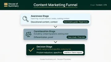
Native ads typically reach people in the awareness or consideration stage — not the purchase stage. A landing page that immediately pushes for a demo booking or payment will consistently underperform, because it's asking readers to skip several steps in their decision-making process.
Match your CTA to where the reader actually is:
- Awareness stage → offer a guide, report, or educational resource
- Consideration stage → offer a comparison, case study, or free trial
- Decision stage → direct to a product page or short lead form
Advertisers placing native ads in premium newsletter environments — like House of Summary's network, which reaches executives, finance professionals, and global decision-makers — face this alignment challenge more than most. These readers opted in to receive curated, carefully edited editorial content.
A landing page that doesn't match that standard will underperform regardless of how strong the ad creative was.
The Must-Have Elements of a High-Converting Native Ad Landing Page
Headline
Research cited by Copyblogger puts it plainly: 8 out of 10 people read the headline, but only 2 out of 10 read further. Your headline does most of the conversion work by itself.
For native landing pages specifically, the headline must carry the promise from the ad forward. If the ad teased "How Finance Executives Are Rethinking Portfolio Risk in 2025," the landing page headline should continue that narrative — not pivot to a generic product tagline.
Avoid clickbait the page can't deliver. A headline that overpromises creates a trust gap the rest of the page has to spend words recovering from.
Hook Copy and USP
The first paragraph has one job: validate the reader's decision to click. Acknowledge their curiosity or pain point, and signal that what follows will deliver on the ad's implied promise.
Put your unique selling proposition (USP) within the first scroll. Use a subheading or visual callout so skimmers absorb the core differentiator without reading every word — assume most won't.
A secondary CTA can appear here for readers who are already primed to act. Don't make them scroll to the bottom to find a button.
Visuals
Product screenshots showing real outcomes outperform generic stock photography. Why? Because they demonstrate how the product actually works, which reduces perceived risk and builds confidence faster than any headline can.
If the native ad ran in an editorial environment, the visual quality on the landing page should match it. A polished ad followed by a grainy or generic page image tells the reader they've landed somewhere less credible.
Social Proof
Testimonials, client logos, star ratings, and media mentions reassure skeptical readers — particularly those arriving from native placements, where they weren't actively searching for your product. Research from CXL shows that specific, short quotes from real users outperform polished marketing testimonials.
Keep testimonials concrete:
- Works: "This saved our finance team 6 hours a week"
- Doesn't work: "Excellent product, highly recommend"
The difference is specificity. Vague praise reads like filler; measurable outcomes read like evidence.
CTA
One primary CTA. Make it specific — "Download the Free Risk Report" beats "Learn More" every time. A secondary, lower-commitment option at the bottom gives readers who've consumed everything a place to go without forcing them to re-scroll.
Key principles for CTA placement:
- One dominant action per page
- Secondary CTA should be lower-commitment (e.g., "Watch a 2-min demo")
- Competing options reduce clicks — if two CTAs feel equal, cut one
How to Match Your Landing Page to Your Native Ad Audience
Audience Temperature Determines Everything
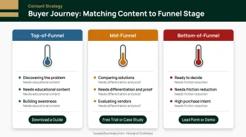
The reader's awareness level — how much they know about the problem and your solution — should dictate both your content format and your CTA type.
| Audience Stage | What They Need | CTA Type |
|---|---|---|
| Top-of-funnel (discovering the problem) | Educational content, context | Download a guide, read more |
| Mid-funnel (comparing solutions) | Differentiation, proof | Case study, free trial |
| Bottom-of-funnel (ready to decide) | Friction reduction, specifics | Lead form, demo request |
Format Alignment
If your native ad used a "how-to" editorial framing, the landing page should deliver a how-to article or structured guide. If the ad used an interactive hook or quiz format, the landing page should continue that interaction — a multi-step form or quiz completion keeps readers in the experience rather than snapping them into a different mode.
The format shift is often where native campaigns lose readers. Readers notice the disconnect before they consciously register it — and when they do, they leave.
The Premium Newsletter Context
Readers arriving from a premium newsletter environment carry different expectations than those arriving from programmatic display placements. They've opted in, they're actively reading, and they trust the editorial environment enough to grant it inbox access.
House of Summary's newsletter network, for example, reaches 500,000+ subscribers — executives, business operators, and professionals across the US, UK, and UAE who open newsletters because their work requires staying informed. The attention they bring to the editorial content transfers directly to your ad and landing page.
That's an advantage, but it raises the bar. A generic sales page following a placement in Dubai Summary or London Summary breaks editorial trust immediately. The landing page needs to match the substance and visual quality those readers expect.
Segment-Specific Pages
The same logic applies when you're running native ad variations across different segments. If you're targeting by geography, industry, or interest, build separate landing pages for each — sending all traffic to one generic page wastes the segmentation work you did on the ad side.
Tailor the headline, examples, and CTA language to the specific segment. A finance executive in New York and a business owner in Dubai are likely interested in the same product, but the framing that earns their trust will differ.
Pre-Lander vs. Direct Landing Page
Definitions: Pre-Lander and Direct Landing Page
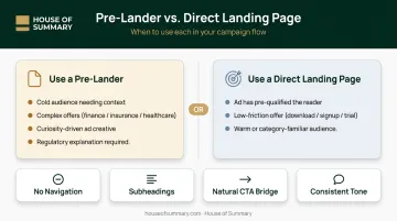
A pre-lander is an intermediate, editorial-style page between the native ad click and the actual offer or lead form. It warms up readers with educational content before presenting a CTA — essentially extending the content-reading experience before asking for anything.
A direct landing page skips the warm-up entirely and delivers readers straight to the offer or form. It works when the ad itself has already done the persuasion work.
Choosing the Right Approach
Pre-landers work best when:
- The audience is cold and needs context before they'll act
- The offer is complex (financial services, insurance, healthcare)
- The native ad creative was purely curiosity-driven with no explicit offer
- Regulatory constraints require explanation before a compliance-sensitive CTA
Direct landing pages work better when:
- The native ad has already pre-qualified the reader
- The offer is low-friction (newsletter signup, free download, trial)
- The audience is warm or familiar with the category
Finance, health, and insurance advertisers — well-represented across premium newsletter networks — tend to default toward pre-landers. Their audiences need education before they're ready to act.
Pre-Lander Best Practices
- Remove navigation bars — every external link is a leak
- Use subheadings so skimmers can follow the argument without reading every word
- Bridge naturally to the offer with a CTA that feels like the next logical step, not a pivot
- Keep the editorial tone consistent from the native ad through the pre-lander to the offer page
How to Test and Continuously Improve Your Native Landing Pages
A/B Testing Fundamentals
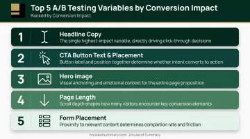
Test one variable at a time. The variables with the highest conversion impact are typically:
- Headline copy — small wording changes often produce the largest lifts
- CTA button text and placement — "Get the Free Report" vs. "Download Now" can shift results meaningfully
- Hero image — product screenshots vs. lifestyle imagery vs. infographics
- Page length — long-form vs. short-form depending on audience awareness level
- Form placement — above the fold vs. after social proof
According to VWO's A/B testing research, systematic A/B testing is one of the most reliable methods for improving conversion rates — but only when tests run long enough to reach statistical significance and isolate single variables.
Post-click testing (changing the landing page independently of the ad) is more efficient than rebuilding an entire campaign. Change the page, keep the ad, and isolate the landing page's contribution to performance.
Continuous Improvement Framework
Use performance data to find where readers are dropping off, then fix the weakest point first:
- High bounce rate → headline or message match problem
- Low scroll depth → the hook copy or visuals aren't holding attention past the fold
- High time on page with low conversion points to a CTA placement, friction, or trust issue
- Form abandonment usually comes down to length — cut fields or reorder the sequence
Never treat the first landing page as the final version. Native ad campaigns that iterate on landing pages consistently outperform those left unchanged after launch.
Follow-Up Strategy
Capturing a lead on the landing page isn't the finish line. Research from Demand Gen Report consistently shows that B2B buyers require multiple touchpoints before making a purchase decision — most leads who provide their information won't convert immediately.
The landing page starts the relationship. What happens next determines whether that lead converts. Effective follow-up typically includes:
- Email nurturing sequences tied to the specific offer or topic
- Retargeting ads based on landing page behavior (scroll depth, form abandonment)
- Timed follow-up cadences that match the buyer's decision timeline
Frequently Asked Questions
What is the difference between a native ad landing page and a regular landing page?
Native landing pages are built specifically for readers arriving in a content-reading mindset, not a buying mindset. They use editorial-style layouts, content-first design, and softer CTAs that warm up readers before asking for action — rather than the direct sales framing that works for search or retargeting traffic.
Should I send native ad traffic to a pre-lander or directly to my product page?
Cold, top-of-funnel audiences benefit from pre-landers that educate before converting. Warm audiences or low-friction offers (a newsletter signup, free download) can go straight to the offer page.
How many CTAs should a native advertising landing page have?
One primary CTA, positioned clearly and worded specifically. An optional lower-commitment secondary CTA at the bottom of the page gives readers who've finished reading somewhere to go without forcing a repeat scroll to the main CTA.
What content formats work best on native advertising landing pages?
How-to articles, listicles, quiz-style formats, and editorial long-form content perform well because they match the content-discovery context where native ads appear. These formats keep readers in a learning mindset rather than triggering the resistance that overtly promotional pages produce.
What is "message match" in native advertising?
Message match is the alignment between a native ad's headline, tone, and implied promise and what the landing page actually delivers. A mismatch — where the ad feels editorial but the page feels like a hard pitch — creates immediate distrust and raises bounce rates.
How do I know if my native advertising landing page is performing well?
Track bounce rate, time on page, scroll depth, and conversion rate. Benchmarks vary by industry and offer type. The most useful measure is improvement against your own baseline through ongoing A/B testing, not comparison to generic industry averages.